About the project
The Timeless project is an alternative collection of already existing articles. For Timeless we selected some intresting articles related to two classic topics, like the "Art of Food and Cooking, and "Tech & Science". But the main mission of this project is not only to offer an aggregator of trivial information, but mostly to create an environment that can bring to the surface some of the alternative, additional, and hidden aspect of those texts. Moreover, one of the main purpose of the Timeless project is to offer a pleasant interface that allows the user to experience the act of reading displaying the proposed articles in different artistic styles inspired by historical past and future event and periods. We like to think about Timeless as a time machine that give us the possibility to experience an aesthetic journey into the history of typography and design, that give us the possibilty to enjoy a flight through centuries, while suspended in space and time.
The main objective of Timeless is not to replace the original position of these articles but it is simply an experiment, developed for or the final examination of the course of Information modelling and web technologies held by Fabio Vitali within the Master Degree in Digital Humanities and Digital Knowledge of the University of Bologna. In fact, all the original locations of the articles presented on Timeless are indicated both in the actual display of the articles and in the desclaimer in the navigation bar. The idea behind Timeless is to create a framework that can contain articles and issues without limits, to which you can easily apply different typographic themes and discover additional metadata and information, capable of enriching the reading experience and thus creating the MMMM (Metadata Model for Modern Magazines) model required. For the moment Timeless offers only a limited selection of articles and issues, chosen by the team that created this project. The articles present were chosen according to the personal interests of the team and with the aim of providing a basis on which to develop the different possible stylistic views. To learn more about the choices made regarding the styles, see the documentation dedicated to each historical period.
Documentation
This section illustrates the reasons and resources that underlie our typographic and stylistic choices for each historical period.
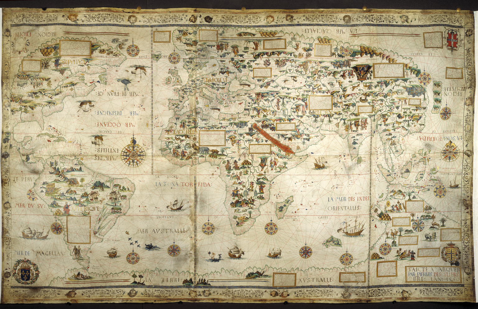
1550 - Habsburg–Valois War, the Last Italian War
Italian renaissance is a period in Italian history that covered the 15th and 16th centuries, developed a culture that spread across Europe and marked the transition from the Middle Ages to modernity. The Italian renaissance has a reputation for achievements in painting, architecture, sculpture, literature, music, science and technology. Italy became the recognized European leader in all these areas by the late 15th century during the era of peace of Lodi agreed between Italian states. However, apart from the artistic excellence that Italy knew, in the middle of 16th century there was a fierce dispute with France over the excellence point of the two countries.
The Italian War of 1551–1559, sometimes known as the Habsburg–Valois War and the Last Italian War, began when Henry II of France, who had succeeded Francis I to the throne, declared war against Holy Roman Emperor Charles V with the intent of recapturing Italy and ensuring French, rather than Habsburg, domination of European affairs. Historians have emphasized the importance of gunpowder technology, new styles of fortification to resist cannon fire, and the increased professionalization of the soldiers.
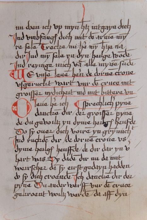
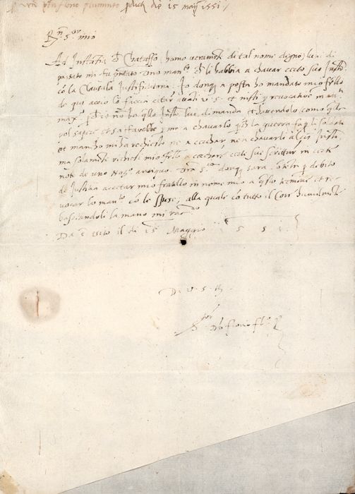
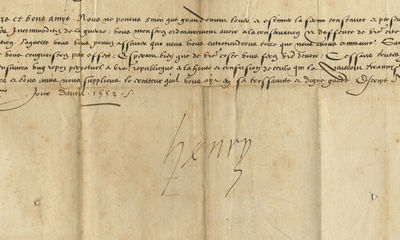
The decision to focus on this historical event of that period made our quest to reach the letters that were sent at a rapid pace to inform about the events of the time, the military agreements, and their communication. But the most important letter of the period is still the letter with which King Henry declares that he wants to rule in Italy. This is the reference point for the alternative presentation of our articles for the period of 1550.
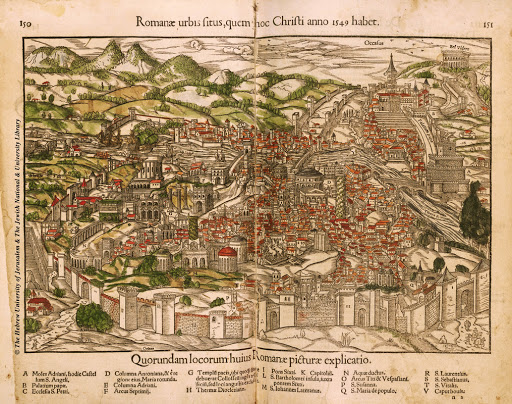
Starting from the background we had to give the feeling of the old letter, so we chose to use as a background an image of old paper to give the feeling of reading an historical document. As for the treatment of the photographs, we relied on the historical depiction of maps and cities. Characteristic is the yellow color that excels in these illustrations but at the same time the feeling of the other colors. Therefore, we have given the photos a feeling of yellow with the help of the "sepia" filter but at the same time enhancing the colors of the background. As for the font, we studied many letters, and mainly the main point of reference of the letter of King Henry II, we came up with five basic features, the letters in the documents are small, difficult to distinguish as they are interconnected with small spaces and with connecting letters as extended dots at the top or bottom of the letter. These points are usually slightly overemphasized, sometimes having a characteristic curvature, while also creating "points".
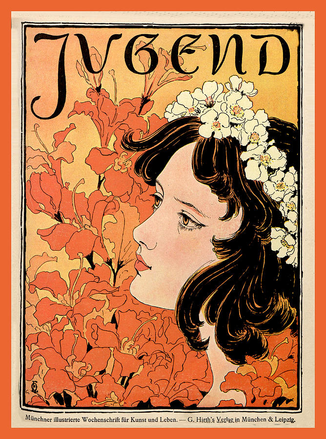
1910 - Art Nouveau
Art Nouveau was an artistic-philosophical movement that was born in France between the end of the nineteenth century and the first decades of the twentieth century and spread throughout Europe, with different names in different countries: in Italy, for example, Art Nouveau was known as "Liberty Style". The historical period of Art Nouveau coincides with what is remembered as the "Belle Époque". Art nouveau was a style that spread easily and influenced the visual arts, architecture and applied arts. From a visual point of view, the works of Art Nouveau are characterized by an accentuated decorative elegance and gentle and sinuous lines that meet and intertwine harmoniously. Art Nouveau was born as a reaction to the industrial production of mass-produced objects made possible by the automation processes of the late nineteenth century. To escape the standardization of the product, the Art Nouveau artists innovated it, embellished it with a personal touch to make it unique. Despite this criticism of mass industrial production, Art Nouveau artists were the first ever to lend their work to the creation of advertising posters that are now considered true works of art. Some of the major artists of this movement were: Aubrey Beardsley, Gustav Klimt, Alphonse Mucha, Henri de Toulouse-Lautrec, Eugene Grasset, Jules Chéret, Georges de Feure, Antoni Gaudí, and several others.
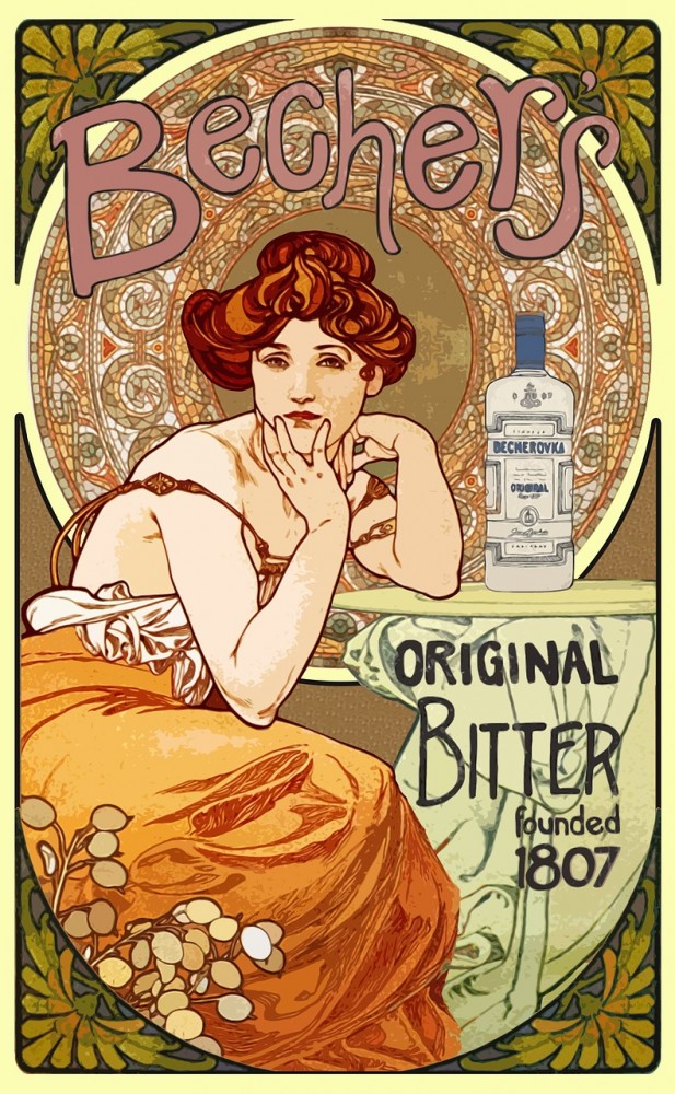
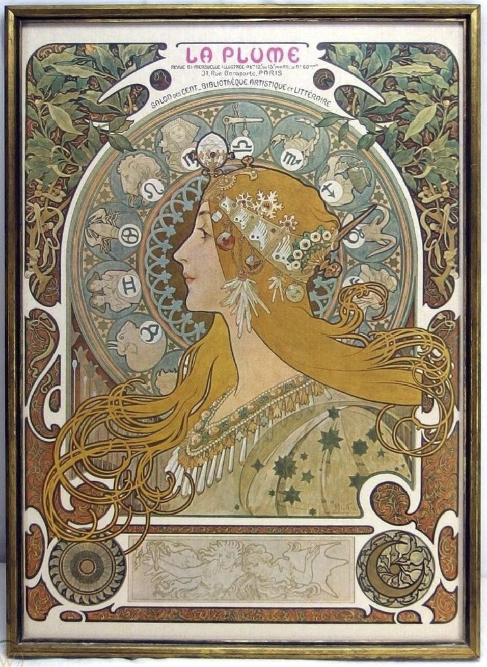
The Art Nouveau style was clearly a style capable of giving all-round expressive freedom. Precisely for this reason, it is difficult to delineate stylistic boundaries within which to include all the creative works produced. A selection was made for the purpose of this project; in fact, starting from the magazine area, an iconic magazine of those years was selected as a reference for the stylist choices made in the graphic line of the project. Likewise, among all the illustrators available, one in particular, has been selected to represent the category with his style on this site. The reference magazine for Timeless is, therefore, the "Jugend" magazine and the artist is Alphonse Mucha.
Jugend magazine was a rather long-lived German magazine that also went through several artistic periods. The Jugendstil, the German Art Nouveau style, took its name from the magazine Jugend, which indicates how the magazine has been significant for art, literature and especially the lifestyle freed from the conventions that Jugend advocated: aesthetics, nature, nudism were proposed to a society that at that time still wore the corset and that was bound by many social conventions. From this magazine, with reference to the images taken as a sample, it was inspired by colours, spacing, the arrangement of the text in columns and fonts. The key elements that we can grasp from the images taken as models are undoubtedly the almost total breakdown of the available space, the crib of decorations (floral or otherwise) and advertising. The font chosen for this project, taken from the reference images, is Eckmann, inspired by Otto Eckmann, one of the prominent members of the Jugenstill stile, as well as a graphic collaborator of the magazine Jugend. The Eckmann font is certainly not one of the simplest fonts to read but particularly decorated and complicated fonts were a distinctive symbol of the Art Nouveau style. As well as the presence of vividly coloured illustrations and advertisements. Given the massive presence of these elements, frequent in the pages of Jugend's volumes, the artist Alphonse Mucha and the style of his illustrations were selected to enrich the visualization of the articles on Timeless. In fact, he was a collaborator of the magazine itself, and it is possible to find several covers and illustrations published by him on Jugend. The images taken as a sample were used to capture the style and to create a palette that is as consistent with the style as possible. Besides, the reproduction of an illustration by Mucha was added to the display of the article on Timeless to give the same sensation of advertising in the margin of the page that could be had by reading a real issue of the magazine.
1960 - Martin Luther King Jr.
The 1960s is admittedly one of the most revolutionary decades, giving multiple impetus to its historicization. It has been characterized by the Vietnam War, Civil Rights Protests, the 60s also saw the assassinations of US President John F Kennedy King, Cuban Missile Crisis, and finally ended on a good note when the first man is landed on the moon.
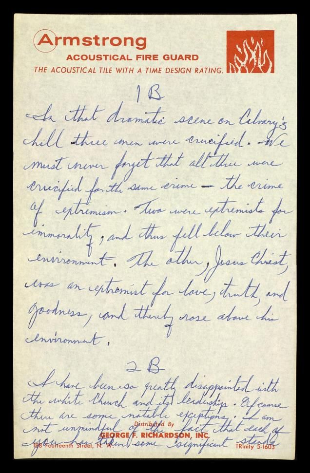
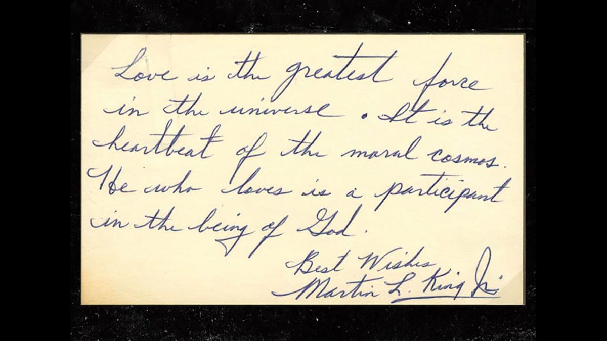
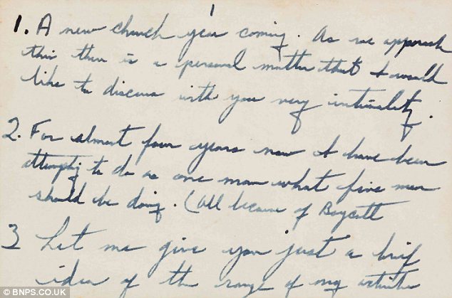
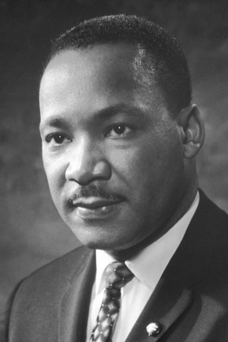
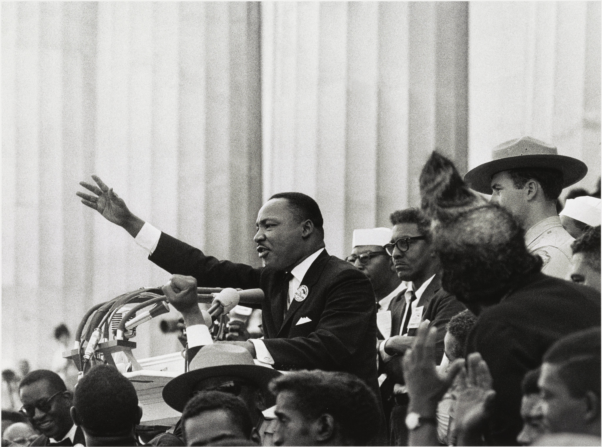
Though, to reconstruct the 60s we have focused on a person who not only found himself at the center of political and sociological controversies, but also inspired and continues to inspire as a social figure through his words. Martin Luther King, Jr., is known for his contributions to the American civil rights movement in the 1960s. His most famous work is his "I Have a Dream" speech, delivered in 1963, in which he spoke of his dream of a United States that is void of segregation and racism.
What would it be like if we could read our selected article thinking that we are reading through his own notes for the work "I have a dream"? To achieve this feeling, we first had to define the background. With the help of CSS, we managed to adapt the background to the texture of the paper of the time with the characteristic light-yellow color and the slightly darker surfaces on the edge. For the photos we chose a remodel in grayscale characteristic colors of the photos of the time as well as a light blur that gives a little more to the feeling of 60s photography. Finally, for the sense of the notes to exist, a font had to be chosen that was very close to the characteristic italicized writing of Martin Luther King, namely we have italics, capitalization and lettering. He used to write with a blue pen while some notes were made in pencil.
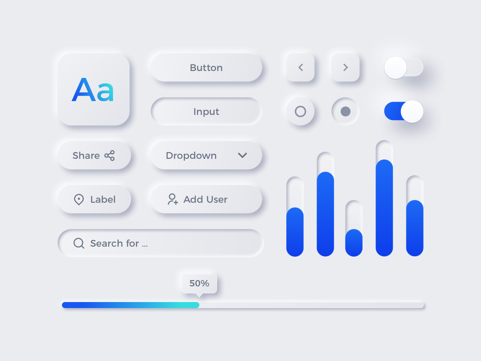
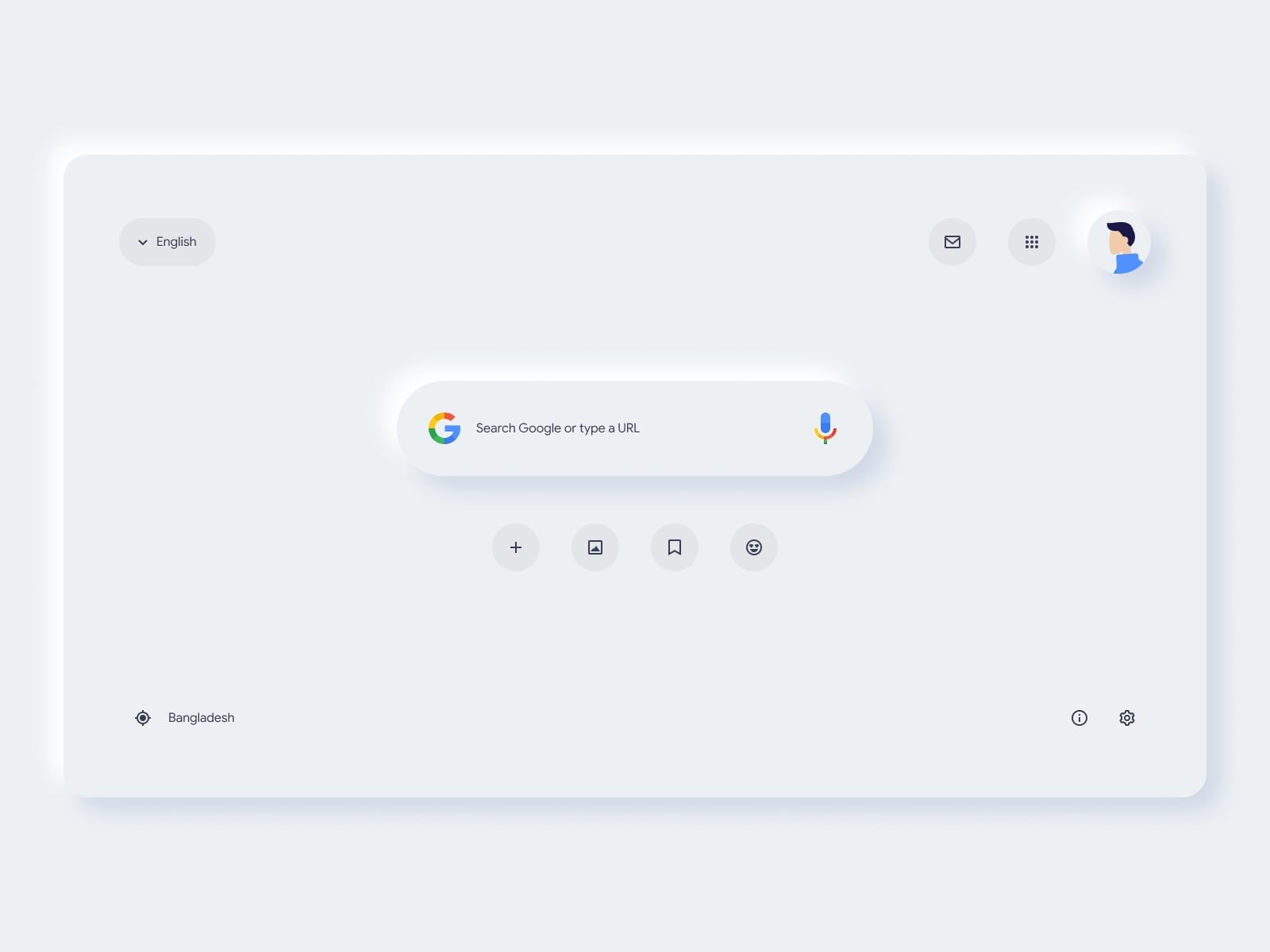
2021 - Neumorphism
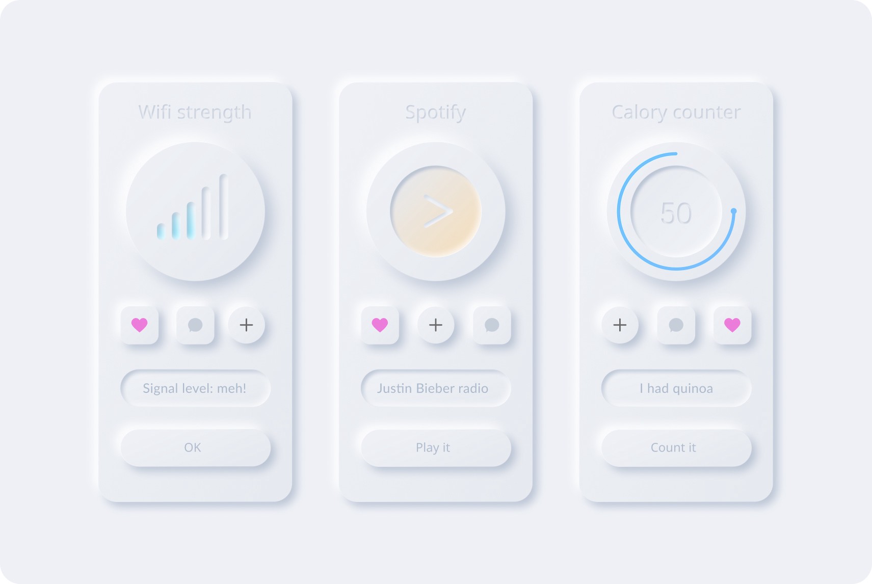
In the difficult and uncertain choice for the styles of the future, a style was chosen for Timeless, or rather a graphic trend, which is already considered a protagonist for the web pages of the next few years, Neumorphism, although some consider it already outdated. One of the greatest difficulties encountered in this choice was in fact being able to define an immediately recognizable and easily identifiable style, a difficult mission considering the speed with which new styles are published. Neumorphism is the successor of the Skeuomorphism style, a graphic current that represents a physical object in digital form by mimicking its appearance, according to a purely aesthetic reason, without the similarity having an effective practical sense. With Neumorphism there is the push from "super flat and minimal" in favour of an interface closer to 3D but without texture. Neumorphism represents a fusion of both trends, with designs mimicking physicality through selective shading while overlaid with semi-flat colours. Most commonly, the effect resembles digital embossing or debossing.
Neumorphism, as it was represented in the visualization of the articles for Timeless, therefore plays on this illusory three-dimensionality, giving light and dark shades to the elements. Being a minimal and modern style, light and “fresh” colours were chosen that allowed the correct perception of the shades of the shadows. For the font, on the other hand, Nunito was selected: a Sans Serif font, well balanced with rounded ends. Nunito was designed by Vernon Adams primarily to be used as a display font, but can also be used as a text font. Nunito was designed to be used freely on the Internet by web browsers on desktop computers, laptops and mobile devices. Precisely for this versatility, it was considered suitable for this style, as well as for its minimal and "light" line that combines perfectly with the colours and shapes of Neumorphism.
The main advantage of this style is the "freshness", at least until it becomes "already seen". In fact, it conveys that breath of fresh air to the interface and makes it stand out from other styles. However, one of the problems that are generally encountered with this style concerns visibility and accessibility. To try to limit it, within the Timeless project, it was decided to compensate for this with an unjustified text, since studies show that certain categories of users get lost more easily in reading justified texts.

The Team
Henry Ford had said that " Coming together is a beginning, staying together is a progress, and working together is a success".This is exactly the formula of our team that is composed by Elena Cavalli and Marina Christodoulou
Elena Cavalli
Elena is a Master's Degree student of DHDK at the University of Bologna. Previously graduated in Humanities.

Marina Christodoulou
Marina is Master's Degree student of DHDK at the University of Bologna. Previously graduated in Theatrology.
Contact Us
This website website was built and managed by two students as an end-of-course project for the "Information Modeling and Web technologies" course of the Master Degree in Digital Humanities and Digital Knowledge of the University of Bologna, but if you are curious or have any questions about the entire project feel free to contact us on our personal emails, we will be very happy to answer!
Alma Mater Studiorum
via Zamboni 34
Bologna, BO 40126, Italia
+39 051 2098642
Take also a look at the our Master's official website!